- An Introduction to Machine Learning | The Complete Guide
- Data Preprocessing for Machine Learning | Apply All the Steps in Python
- Regression
- Learn Simple Linear Regression in the Hard Way(with Python Code)
- Multiple Linear Regression in Python (The Ultimate Guide)
- Polynomial Regression in Two Minutes (with Python Code)
- Support Vector Regression Made Easy(with Python Code)
- Decision Tree Regression Made Easy (with Python Code)
- Random Forest Regression in 4 Steps(with Python Code)
- 4 Best Metrics for Evaluating Regression Model Performance
- Classification
- A Beginners Guide to Logistic Regression(with Example Python Code)
- K-Nearest Neighbor in 4 Steps(Code with Python & R)
- Support Vector Machine(SVM) Made Easy with Python
- Kernel SVM for Dummies(with Python Code)
- Naive Bayes Classification Just in 3 Steps(with Python Code)
- Decision Tree Classification for Dummies(with Python Code)
- Random forest Classification
- Evaluating Classification Model performance
- A Simple Explanation of K-means Clustering in Python
- Hierarchical Clustering
- Association Rule Learning | Apriori
- Eclat Intuition
- Reinforcement Learning in Machine Learning
- Upper Confidence Bound (UCB) Algorithm: Solving the Multi-Armed Bandit Problem
- Thompson Sampling Intuition
- Artificial Neural Networks
- Natural Language Processing
- Deep Learning
- Principal Component Analysis
- Linear Discriminant Analysis (LDA)
- Kernel PCA
- Model Selection & Boosting
- K-fold Cross Validation in Python | Master this State of the Art Model Evaluation Technique
- XGBoost
- Convolution Neural Network
- Dimensionality Reduction
Principal Component Analysis | Machine Learning
Principal Component Analysis (PCA): Principle Component Analysis or PCA is a popular dimensionality reduction technique that reduces the number of features or independent variables by extracting those features with the highest variance. That means it finds the correlation between the independent variables and calculates their variance, then it selects those features that have the highest variance.
If the dataset contains n variables, the PCA will extract m<=n number of independent variables which explains the most variance of the dataset. It is an unsupervised algorithm as it can extract features regardless of the dependent variable.
PCA in Python: PCA is a very simple and popular algorithm in practice. In this tutorial, we will implement this algorithm alongside with a Logistic Regression algorithm. For this task, we will use the famous "Wine.csv" dataset from the UCI machine learning repository. Our version of the dataset contains thirteen independent variables that represent various aspects of wines and one dependent variable that represents the three types of buyers of the wine based on specific features. Now, we will implement PCA to reduce the number of independent variables to a defined value(i.e. two).
You can download the whole dataset from here. You will get the full code in Google Colab also.
First of all, we import essential libraries.
#Importing the libraries
import numpy as np
import matplotlib.pyplot as plt
import pandas as pd
Now, let's import the dataset and make a feature matrix X and dependent variable y
#Importing the dataset
dataset = pd.read_csv('Wine.csv')
X = dataset.iloc[:, 0:13].values
y = dataset.iloc[:, 13].values
Then we will split the dataset and apply feature scaling.
# Splitting the dataset into the Training set and Test set
from sklearn.model_selection import train_test_split
X_train, X_test, y_train, y_test = train_test_split(X, y, test_size = 0.2, random_state = 0)

# Feature Scaling
from sklearn.preprocessing import StandardScaler
sc = StandardScaler()
X_train = sc.fit_transform(X_train)
X_test = sc.transform(X_test)
Now, we have come to the most important part of the tutorial. Let's implement the PCA algorithm into our dataset.
# Applying PCA
from sklearn.decomposition import PCA
pca = PCA(n_components = 2)
X_train = pca.fit_transform(X_train)
X_test = pca.transform(X_test)
explained_variance = pca.explained_variance_ratio_
Here, the parameter n_components represents the number of independent variables we want in our datasets(here we take 2). The algorithm will take those two variables with the highest variance. You can see their variance from the explained_variannce vector.
Now we will fit logistic regression to our dataset and predict the result.
#Fitting Logistic Regression to the Training set
from sklearn.linear_model import LogisticRegression
classifier = LogisticRegression(random_state = 0)
classifier.fit(X_train, y_train)

#Predicting the Test set results
y_pred = classifier.predict(X_test)
Let's see how good our model is for making predictions using the confusion matrix.
# Making the Confusion Matrix
from sklearn.metrics import confusion_matrix
cm = confusion_matrix(y_test, y_pred)
The confusion matrix will look like following
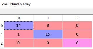
From the above matrix, we can calculate the accuracy of the model and that comes out to be 97%, quite impressive!
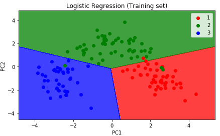
Now, let's visualize both our training and test sets.
# Visualising the Training set results
from matplotlib.colors import ListedColormap
X_set, y_set = X_train, y_train
X1, X2 = np.meshgrid(np.arange(start = X_set[:, 0].min() - 1, stop = X_set[:, 0].max() + 1, step = 0.01),
                     np.arange(start = X_set[:, 1].min() - 1, stop = X_set[:, 1].max() + 1, step = 0.01))
plt.contourf(X1, X2, classifier.predict(np.array([X1.ravel(), X2.ravel()]).T).reshape(X1.shape),
             alpha = 0.75, cmap = ListedColormap(('red', 'green', 'blue')))
plt.xlim(X1.min(), X1.max())
plt.ylim(X2.min(), X2.max())
for i, j in enumerate(np.unique(y_set)):
    plt.scatter(X_set[y_set == j, 0], X_set[y_set == j, 1],
                c = ListedColormap(('red', 'green', 'blue'))(i), label = j)
plt.title('Logistic Regression (Training set)')
plt.xlabel('PC1')
plt.ylabel('PC2')
plt.legend()
plt.show()
The graph will look like the following illustration:
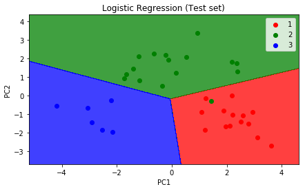
# Visualising the Test set results
from matplotlib.colors import ListedColormap
X_set, y_set = X_test, y_test
X1, X2 = np.meshgrid(np.arange(start = X_set[:, 0].min() - 1, stop = X_set[:, 0].max() + 1, step = 0.01),
                     np.arange(start = X_set[:, 1].min() - 1, stop = X_set[:, 1].max() + 1, step = 0.01))
plt.contourf(X1, X2, classifier.predict(np.array([X1.ravel(), X2.ravel()]).T).reshape(X1.shape),
             alpha = 0.75, cmap = ListedColormap(('red', 'green', 'blue')))
plt.xlim(X1.min(), X1.max())
plt.ylim(X2.min(), X2.max())
for i, j in enumerate(np.unique(y_set)):
    plt.scatter(X_set[y_set == j, 0], X_set[y_set == j, 1],
                c = ListedColormap(('red', 'green', 'blue'))(i), label = j)
plt.title('Logistic Regression (Test set)')
plt.xlabel('PC1')
plt.ylabel('PC2')
plt.legend()
plt.show()
The graph will look like the following: